Have you ever tried to mark or to draw something that reflects your feelings or ideas at a specific location? Or, have you ever recalled an unforgettable memory when you visited an old place?
People’s memories have a high correlation with locations. They like to link the unforgettable things with the place they went and document that moment via media. They use postcard, doodle, photo or the other media to store their memory and they love to share with others who also have the same experience or idea. Exploring people’s thinking and responses is an interesting way for people to interact with each other.
For this project, we are passionate about transforming the way that people communicate their memory and ideas with friends and strangers at the physical location. We want to continue the experience of these physical media yet in a digital way and provide a new approach for people to deliver and review other’s creations.
| Date: | 2018 |
| My Role: | UX Designer, UX Engineer |
| Member: | Chu-Yu Jannie Cheng(UX reseacher) Xiaochuan Kou(Visual Designer) Puhe Liang |
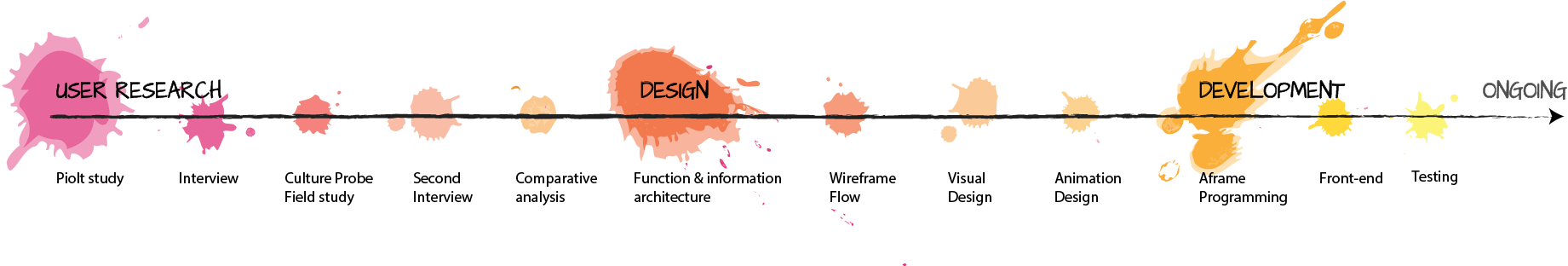
The original goal for our team was to create a platform that connects people and exchanges their memory and the emotion of an important moment at a specific location. We started exploring all channels used for recording and sharing their ideas and feeling and the connection with the physical place. We studied college students around us and people on social media.
The goal of our study is
At the pilot study, we tried to understand the way that people leave and share the moment with friends and how do people react to these message through social approaches. We hold several interviews with people who like to travel or love to record their life and try to find the potential opportunities for us.
We focused on three types of activities
The interview questions include:
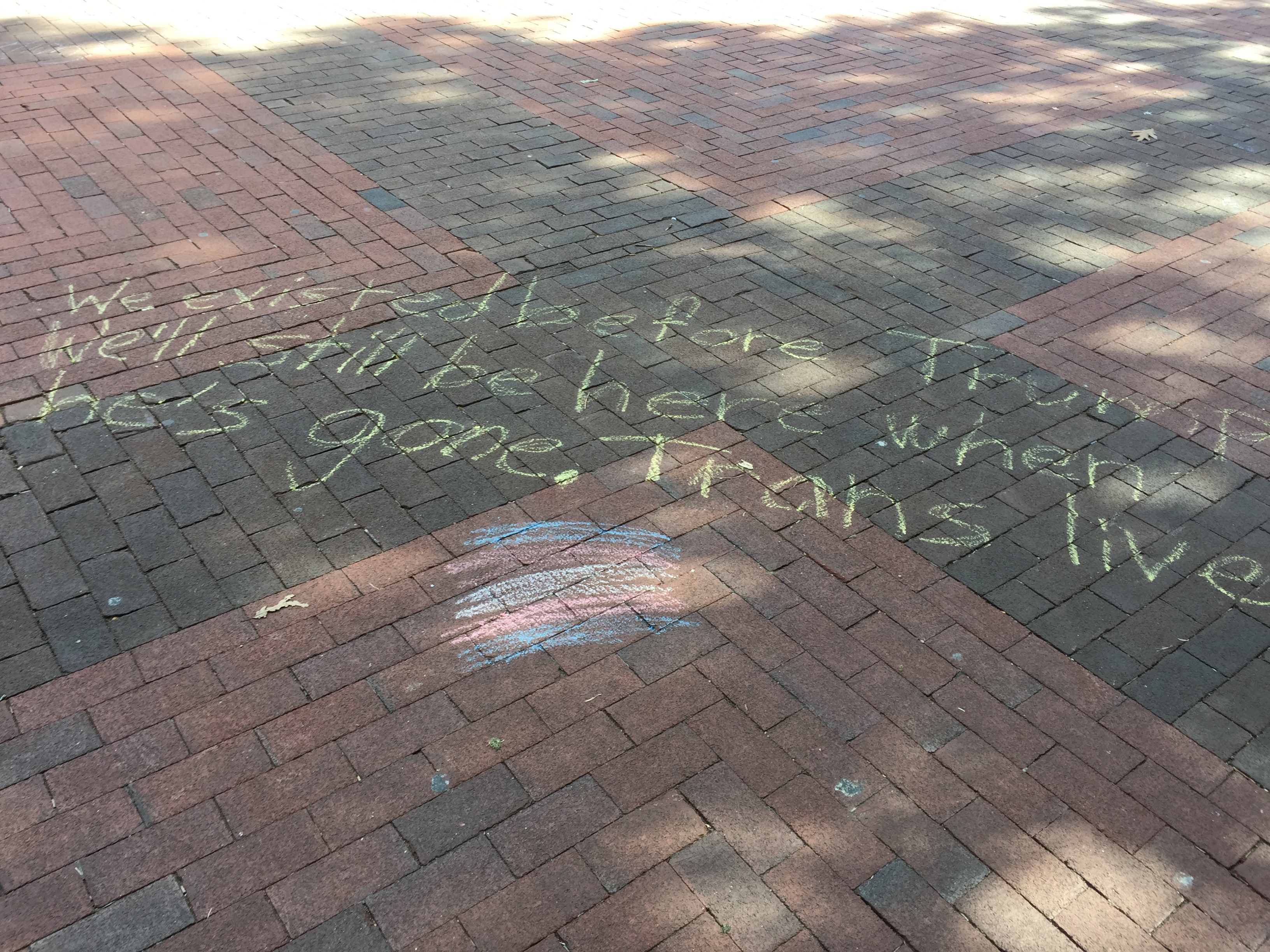
After studying these three behaviors, we specifically interested in doodle activity. Graffitis/doodles have its unique traits. It could not only send the message but also provide the visual surprise that encourages readers.
We were attracted by the way that graffitis groups people and transfers the message. We observed that people like to create graffitis every day privately or publicly. The graffiti surrounds us. Some of them symbolize memory for a certain period of time for a group of people; some are just random doodles that people made to record their lives; some are the responses for previous creations. All the graffitis pass the memorial moment and ideas to people.
However, not all the places allow the public to draw doodles. There are just a few places for people to draw and it is hard for other people to explore them. Thus, we like to transplant the physical experience into the virtual world that is much easier for the public to access. Moreover, digital creations are easy to maintain and track through the internet. It provides a new way for creators to interact with each other and share their ideas. So, we established the goal of our project:
However, not all the places allow the public to draw doodles. There are just a few places for people to draw and it is hard for other people to explore them. Thus, we like to transplant the physical experience into the virtual world that is much easier for the public to access. Moreover, digital creations are easy to maintain and track through the internet. It provides a new way for creators to interact with each other and share their ideas.
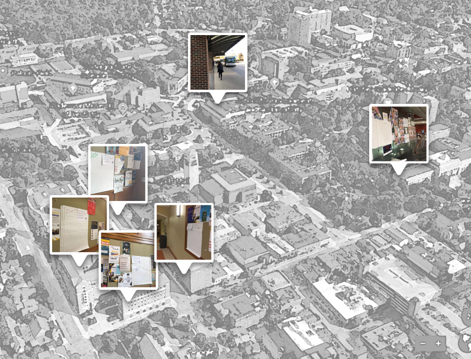
In order to understand how do people communicate through doodle, we adopted the UX research method, culture probe. We posted 6 posters that have a large empty place and the instruction for UofM people. We also added few prompts on the poster to encourage people to draw on it. We posted it at 6 locations, vending machine area, student lounge, activity/ event area, and bus station. The goal for this culture probe study are:
The duration of this culture probe study was 3 days. We kept tracking the poster and were inspired by the evolution of doodles. We collected it back at the end of the study and got total 4 posters after 3 days. We interpreted all the collected posters and found out some insights from the doodles.
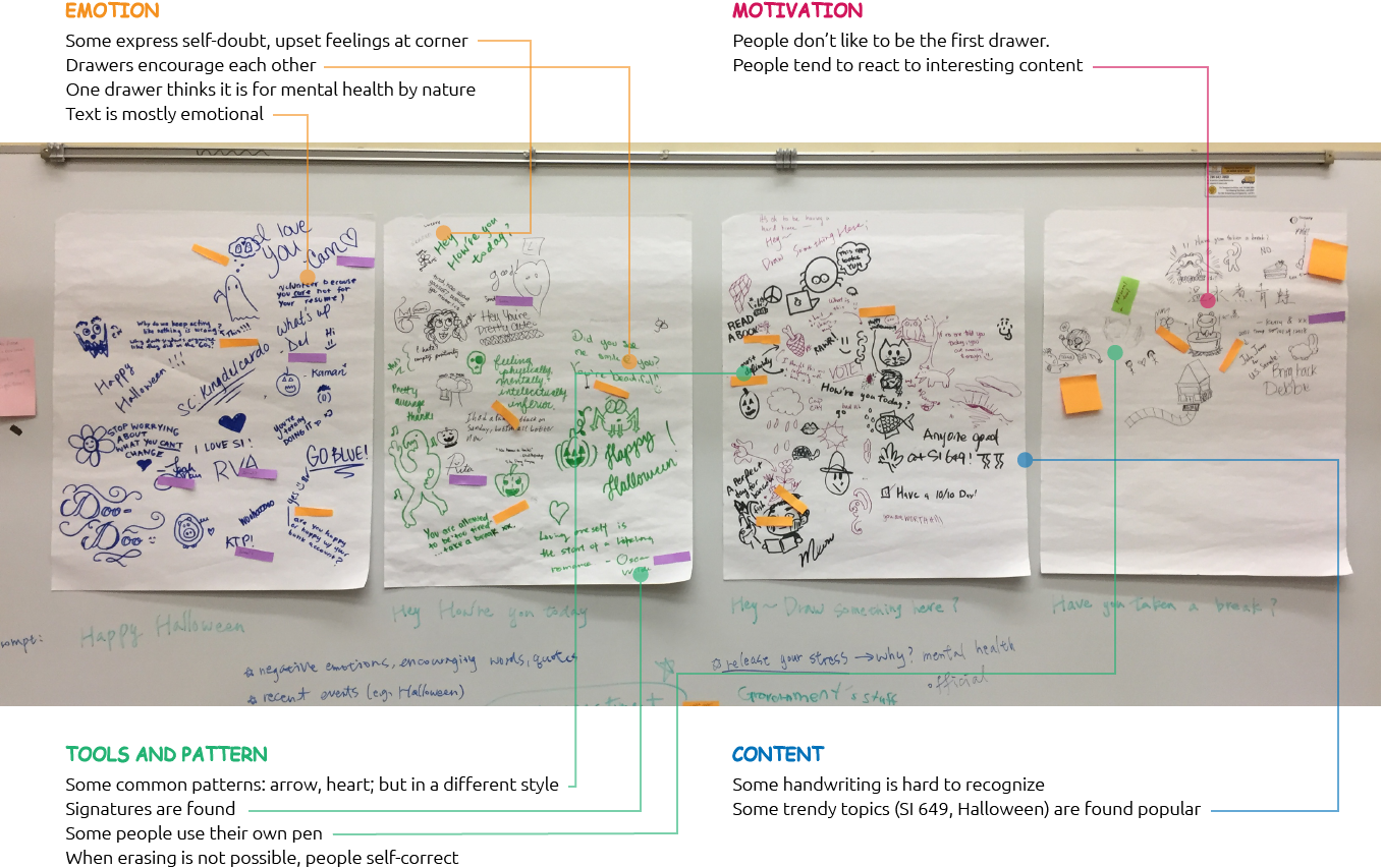
From the posters, we discovered several interesting patterns and came out the design principles for the further design phase. However, we also had some questions for the doodlers. Thus, we hold the second interviews and invited the people who drew on our doodle posters.
We were curious about:
From the interviews, we learned
Based on the UX research and the observation, I transformed the insights into several principles that the design should follow.
Provide prompt to motivate users to draw/view the doodle at the specific location
Helping users to explore the order of doodle evolution
The common pattern could be included in frequently used tools
Connect to users’ existing social network to streamline the sharing behavior
Help users to manage their own creation and collection
Keep users updated about the status of their doodle and collection
Since we like to connect people through digital doodle at the specific location, we need a media that could display the digital creations in the physical world. Augmented Reality (AR) is the perfect technology that could add the digital doodle in the real world. Without change the real environment, AR could create another channel that allows users to add their doodle and share with friends.
In order to learn how do people draw in AR environment, we studied several AR drawing apps and look into the interaction flow and the provided tools.
We focused on the following function: (1) Onboarding process and design, (2) Drawing tools, (3) Sharing approaches
Something we learned from these apps:
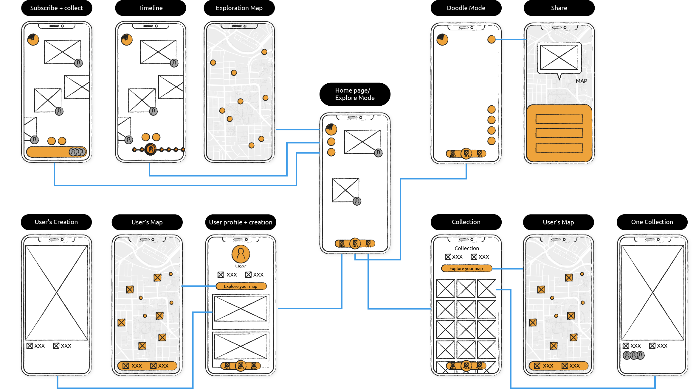
After digesting all insights from UX research and comparative analysis, we started to establish Duudo's structure. We prioritized the functions based on the frequency of use, the importance, and the correlation. We walked through the main functions of this application based on the user journey and came out the below diagram
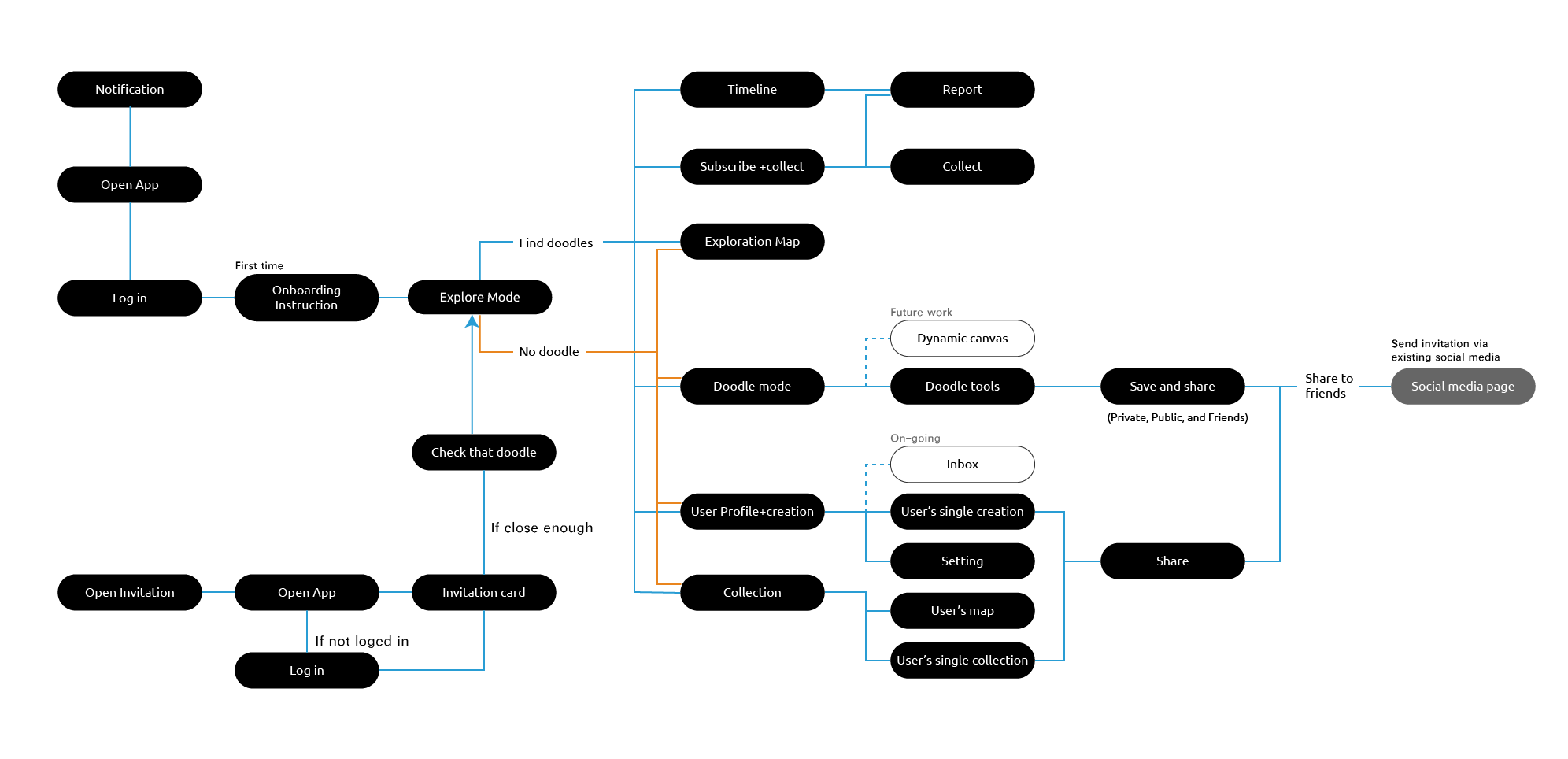
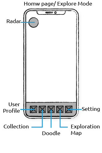
This is the first design proposal from the teammate. At that time, we also focused on drawing behavior itself, rather then consider more about the social feature. Thus, the focused function is doodling. We put all doodle tool on the home page and designed a menu button for other potential functions. The menu was designed on the bottom-left and all doodle tools are present as default on the right-hand side.
Pros:
Cons:
The second design proposal tried to solve the menu problem. The major two functions, user profile, and collection are isolated into the homepage.
Pros:
Cons:
As the project progresses, we find that users need more functions. In order to letting users access the major functions quickly, we tried the traditional 2D tab bar.
Pros:
Cons:
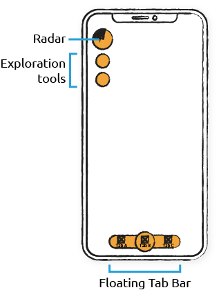
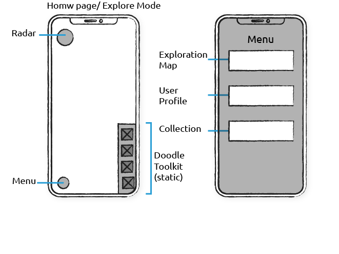
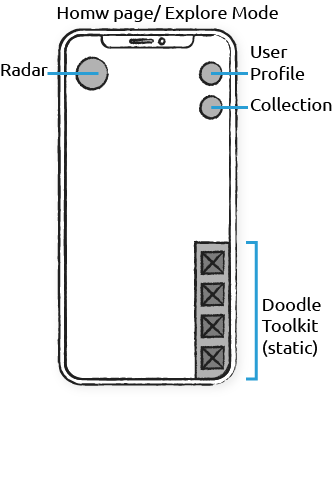
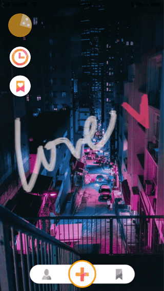
After considering the AR design guideline and the functions' hierarchy, I organized the structure again. The major three functions, doodle, user profile and collection, are selected to show on the tab bar. I also redesigned the tab bar. In order to show the AR view as many as possible, I transformed the bar as the floating bar. The floating bar doesn't block the whole bottom area. It provides more space to display the AR view and keeps the same functionality.
AR applications are very popular in the app market. Lots of applications provide the fancy and impressive interaction with AR technology. However, a user-friendly application is not just about the fancy 3D interaction in the AR world. Designers still need to consider the familiarity and the efficiency of operation.
Most of the users used to the common 2D interface because they have used the 2D interface for years. They can easily guess and understand the meaning of the designed 2D components. When they jump to the AR, the 3D world, they need more time to understand the gestures of control and the 3D components. Thus, before transplanting all the designs to AR, we must consider the necessity of AR interaction according to the functional characteristics.
For the functions that focus on displaying a list of information or a cluster of repeated components, I believe that the traditional 2D interface is the better choice because of the readability issue. 3D interface is not a good way to present a large amount of information. Thus, we decided to use the traditional 2D interface to design the "profile" and "collection" pages. On the other hand, for the functions that have a strong connection with the environment, we use AR to provide the immersive experience.
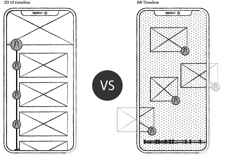
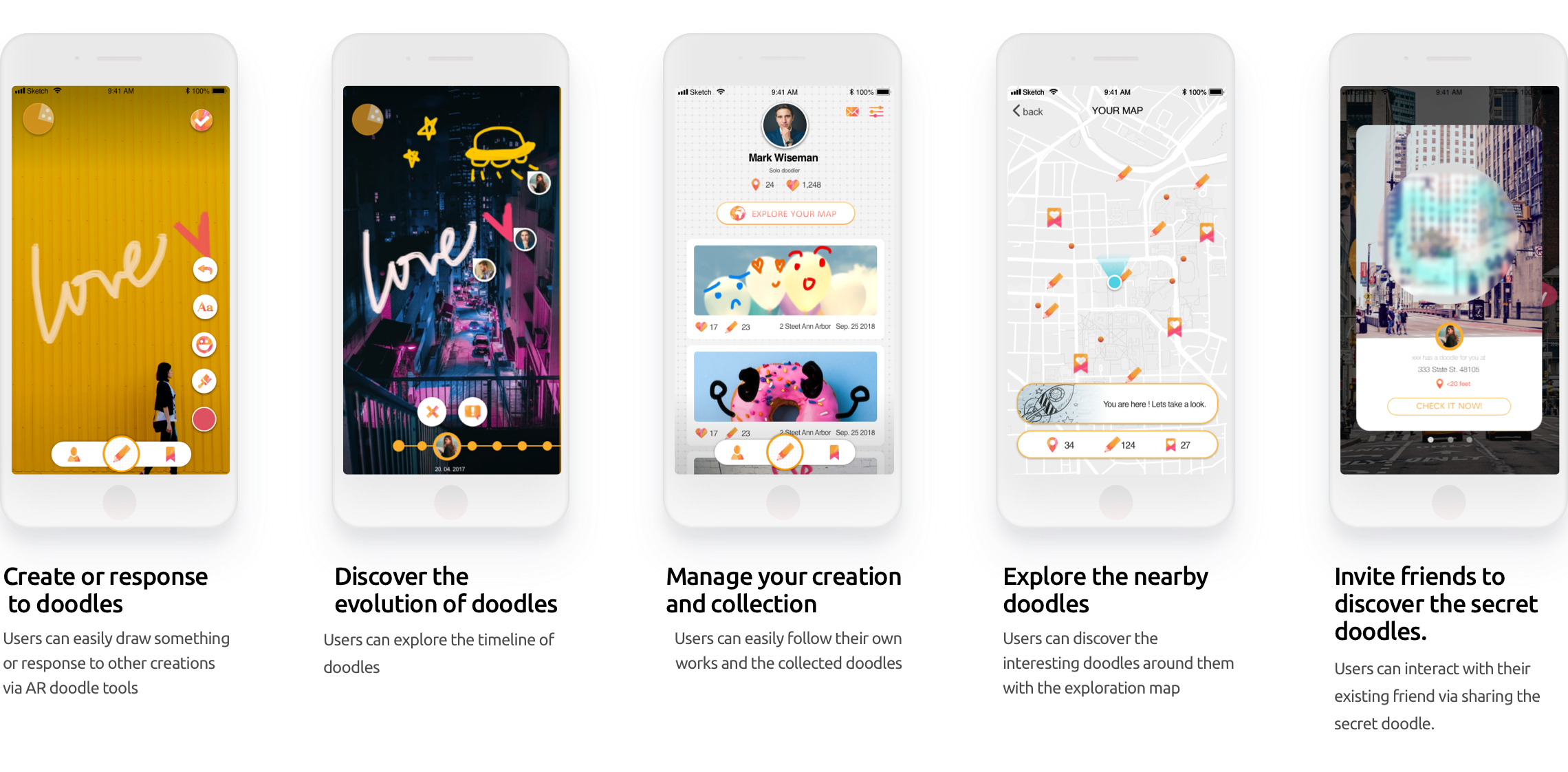
I tried several ways to design the timeline for helping users exploring the doodle evolution. Start from the basic 2D UI to the AR integration. Below lists the iteration of the timeline design.
The first design of the timeline is the traditional 2D interface. I place the first doodle on the top and use the line to connect with the following doodle presenting the creation order. It is a safe design that could display the evolution information, but it lacks for the connection with the real doodle, the AR doodle. Thus, I start thinking about the possibility of showing the timeline in AR view.
To directly interact with the AR doodle around users, I design the scrollable timeline on the bottom of the screen for users to view the change of the doodle wall. There are two version of the AR timeline.
The first version: Slider
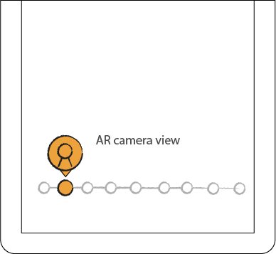
The timeline is a slider with several tick marks. Each tick mark represents a doodle. Users can move the slider thumb around each tick mark and view the change of the doodles wall. The slider is shorter than the screen width. Users can view all tick marks and predict the number of added-on doodles.
However, the marks will be crowded when there are many creations and users might not be able to target the specific one efficiently. Thus, we came out the second version.
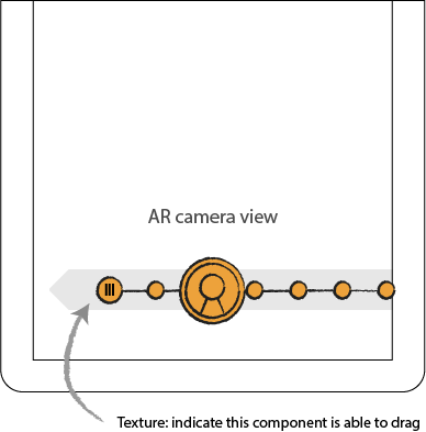
The final design continues the slider concept but transforms it a little bit. The thumb, the circle in the center, is not moveable now but the whole track, the bar behind the thumb, is moveable. Users can swipe the track behind and view each doodle's author. When the tick mark moves under the thumb, the doodle belong to that tick will show up and the author's picture will display on the thumb.
AR Timeline Design
Through our prototype testing section, we discovered some usability issues for the interaction of AR exploration. We observed that participants lost in the AR view and were not able to find the direction of next doodle when they used the timeline function. Users were not able to follow the order of the appearance because the next doodles have random positions.

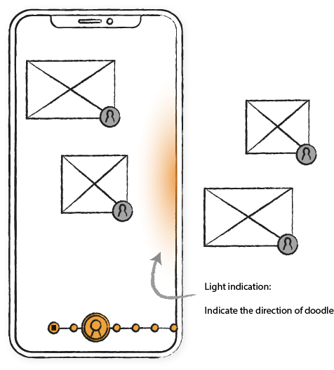
To solve this issue, Duudo needs to provide the indication and guide user to find the correct position and orientation. We carefully studied the AR indication design samples, including the visual component and the audio component. From that, we optimized our timeline design by adding the visual indication, a gradient light, to represents the direction of next doodle at the edge of the screen. Thus, user can follow the indication to find out the next doodle.
After users logged in the application, Duudo provides a participatory instruction for user to experience the first use. To help users getting familiar with the AR environment, Duudo provides prompts and invite users to do the actions. For instance, Duudo invites users to move their devices around and discover the doodles. With the participation, users can quickly adapt the AR interaction and learn how to use the app.
The radar will light up when doodle is detected within 20m. With the hint from the radar, users will be motivated to explore the doodles nearby.
To orientation of users, We make use of compass feature and GPS data to create this active radar.
Users can slide the timeline to see the evolution of doodles around them. The thumb will display the author of the doodle and indicate the time of creation. Additionally, this feature makes our Duudo environment more socially engaged because everyone can trace the timeline of this environment as if they were here all the time.
Research insight:
Considering the surveillance issue, we add the report function for users. We cooperate with users to maintain this co-creation world friendly and safe, preventing the abuse and inappropriate content from happening.
When users discover inspirational creations, they like to provide their feedback and support to it.
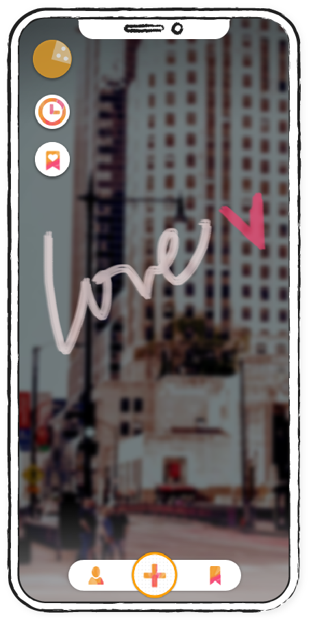
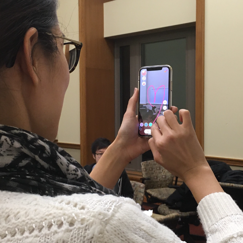
Duudo provides the collaboration function for users to add-on or to draw anything they like. Just simplly tap the plus doodle button, all tools will appear. Users can directly draw the AR doodle by touching their screen.
Duudo provides different doodling tools for the user so that they can take the greatest advantage of this co-creation environment.
Research insight:
The doodle might be:
We provide the “private post” and "Public post" option for user. User could just save and post their work in private.
Some users tend to share the doodles only with their friends because they feel anxious about demonstrating their creations in public. Thus, we provide the “share link” function where users can directly connect with existing social media friends and share the link with a certain group of people.
Research insight:“Sometimes I just want to share this work with my best friends” “I don’t feel comfortable sharing my creations in public when I just randomly drew it”
With the invitation from friends, users can explore the doodle just for them.
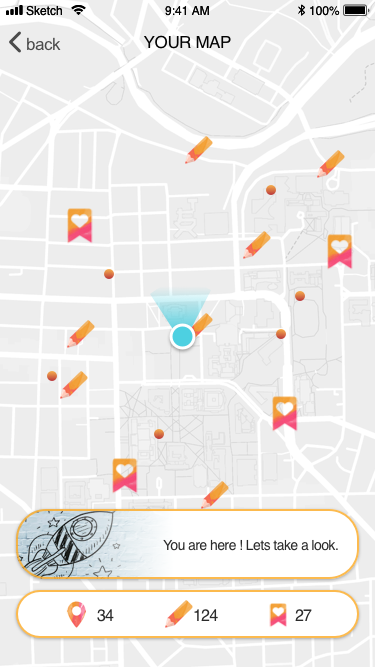
Duudo will detect users' location and count the distance between user and the doodle. The distance keeps updating and displaying on the invitation card. Once user is close to the doodle, user can click the invitation and check the doodle around him(her) in AR view.
We ask the users’ permission of their location and giving notification. By knowing their locations, we can give them notification actively whenever there is popular doodle nearby or some doodles are just being added.
This feature not only increases user engagement. Users will also feel more comfortable starting doodling when there’s already some doodles existing around their environment.
Research insight:
Duudo connects people via the creations. Users' creations and collected creations are the important channels for helping users to interact with other in the community. Thus, helping users to access the created doodles and manage the works is very important.
We provide two major functions, user creation, and collection, for users to manage their work. We use the floating tab bar to present the major three functions of Duudo. Users can quickly access their creations and the creation they collected through the tab bar.
In order to enhance the connection between doodlers, we add the tracking function for the doodle. If anyone adds on users' creations or the doodles they are following, the record will be updated simultaneously.
Research Insight: Doodler curious about what others have added to their creations. They also want to know if they get any comments or supports.
Icons are shown on map, to inform the location of:
Larger icons are used to highlight unchecked updates
In the bottom, we show the total number of liked and owned creations, as well as visited places, to give users a sense of achievement in traveling.