Global hunger and undernutrition are severe problems. However, most people don't have a clear view of this situation and lack of information because the giant and complex data is hard to deliver to people. As the enthusiasts of data visualization, my team and I started to design the visualization for helping people digest the record data from the 1990s.
| Date: | 2018 |
| My Role: | D3 developor, Visualization Designer |
| Teammates: | Dora Weng, Guanchao Huang, Lihan Zhu, Xiaochuan Kou |
We studied the report of Hunger and Undernourishment, we have found some interesting insights, of which the related visualizations also have the potential for us to improve. Following are our goals ( which visualizations of insights to improve) in the form of domain questions:
To achieve the aforementioned goals, we divided the visualization into five parts. We use martini glass visualization structure to guide the audience.
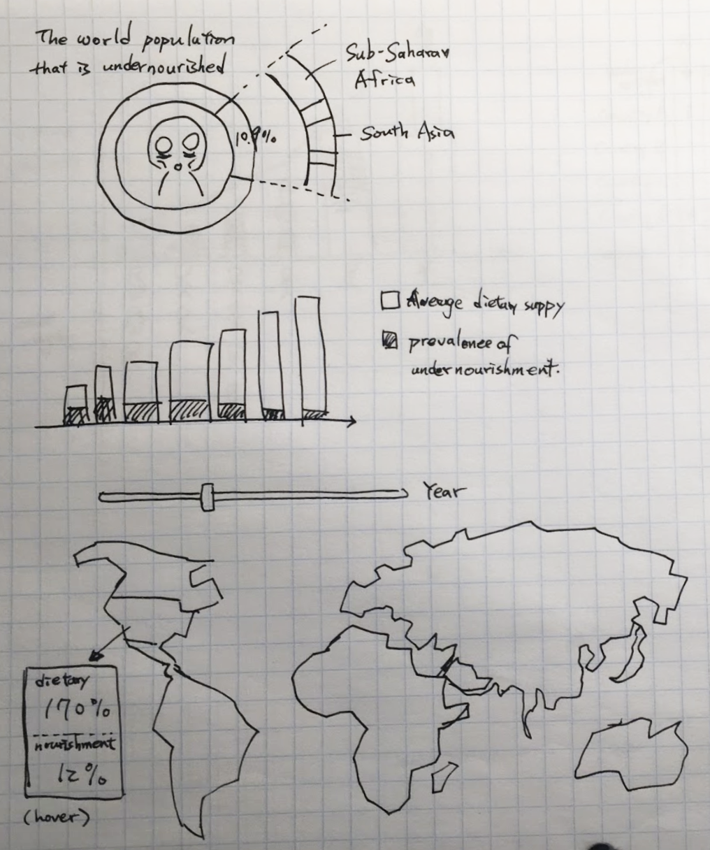
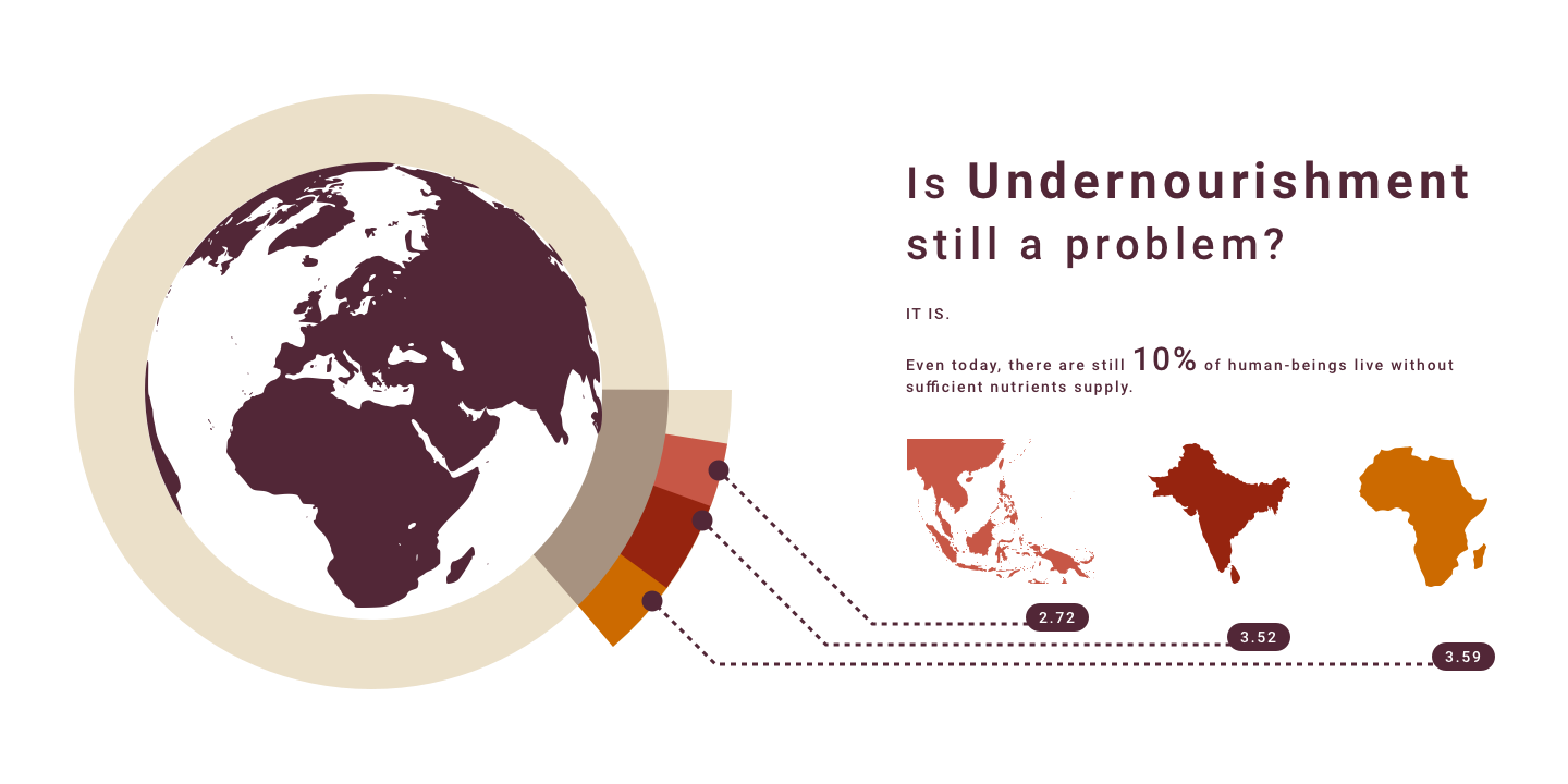
Visualize current situation of undernourishment, which is a related concept that the public is more familiar to
Donut Chart
By showing the share of undernourished population around the world, the chart aims to give a general idea of global undernourishment and its distribution
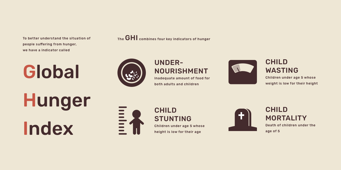
Visualize the definition of GHI
We explain the definition of GHI with static illustrations and short paragraphs.
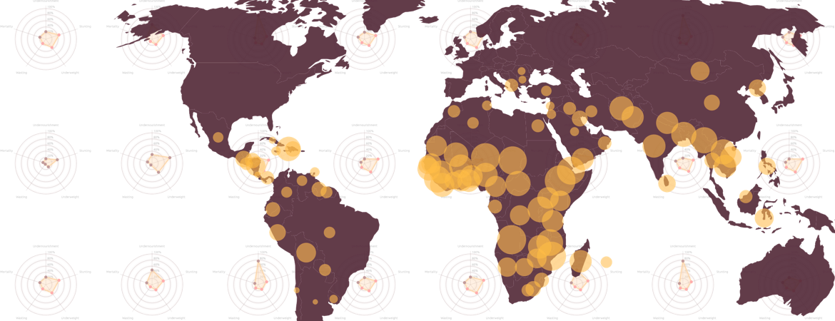
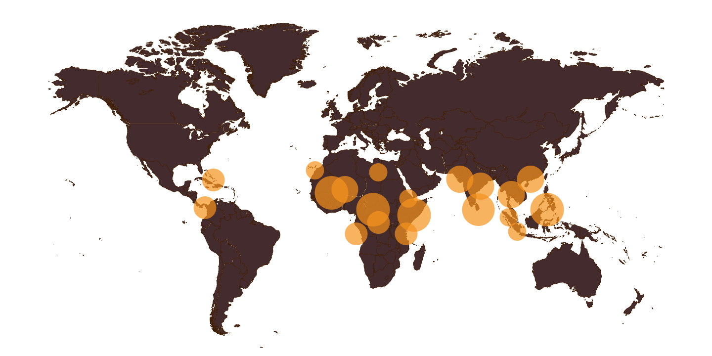
Map
The map indicates the global situation of GHI and allows viewers to have a general sense of spatial distribution from 1992 to 2018.
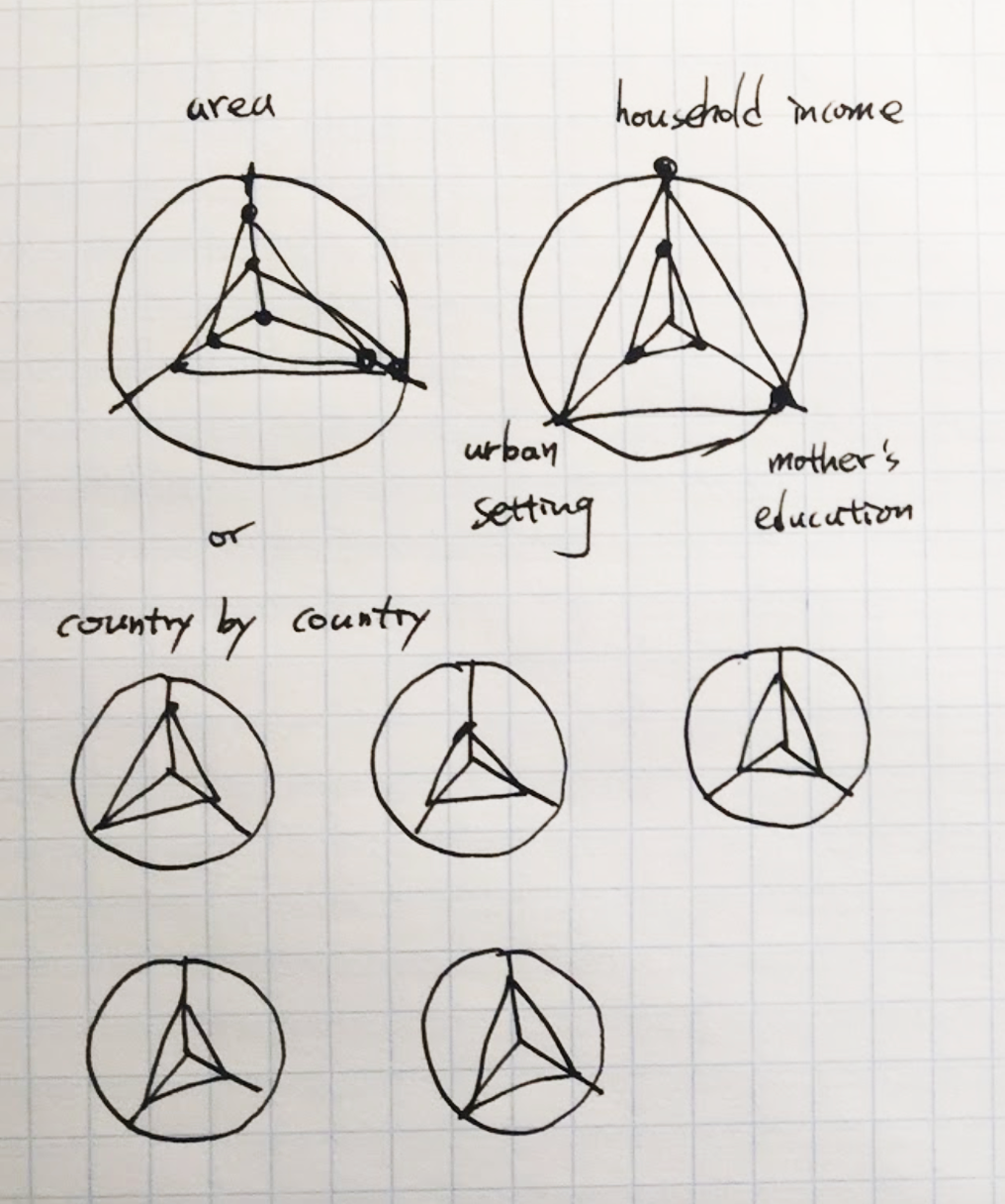
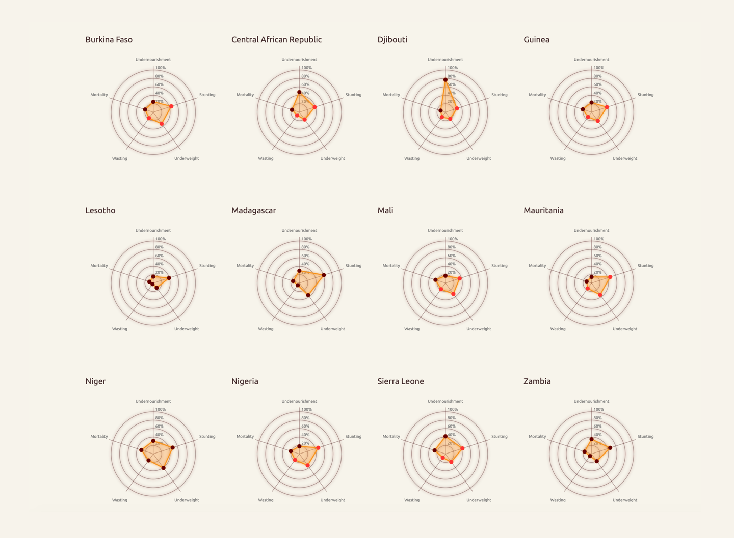
Small Multiples
In order to present the deeper analysis of GHI, we use radar chart that represents each country for demonstrating the factors (Undernourishment rate, stunting rate, wasting rate, mortality rate, and underweight rate) of GHI.
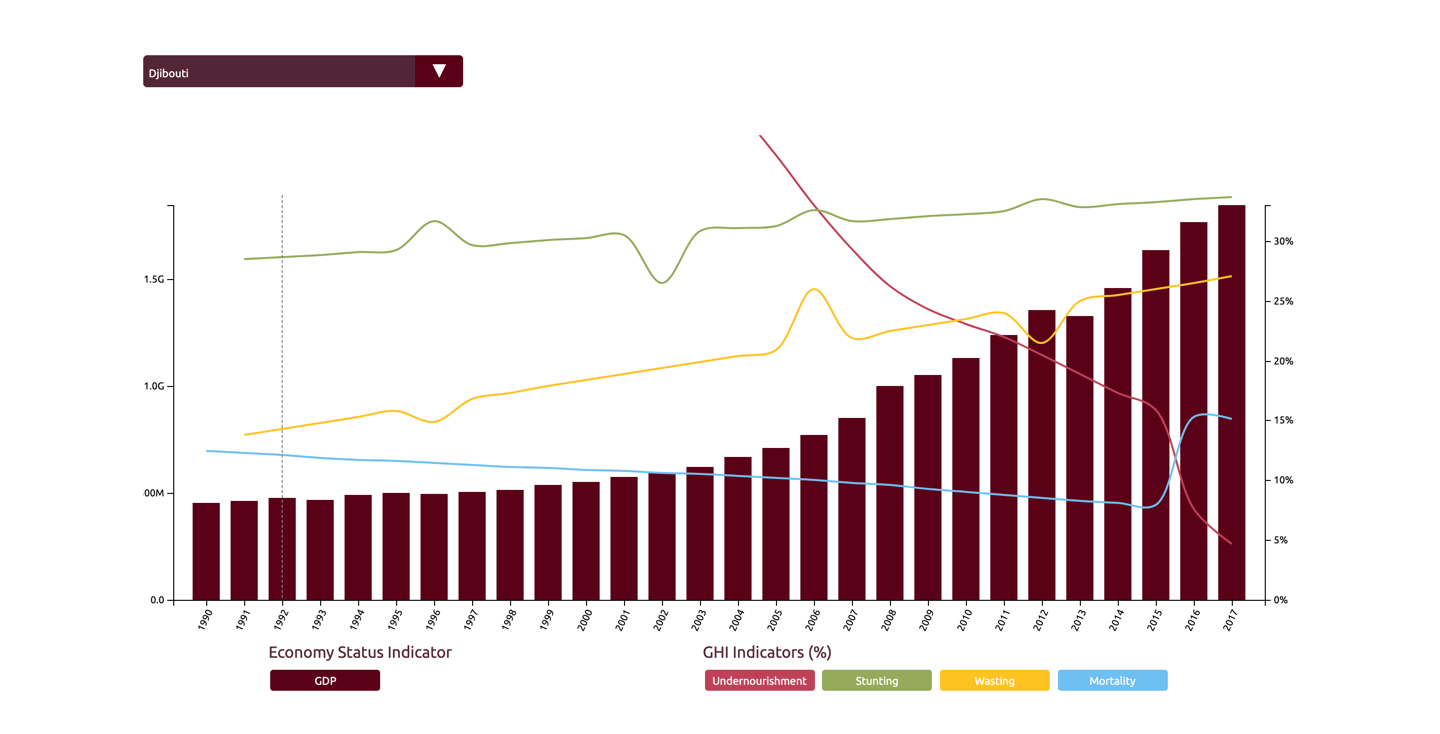
Line & Bar Chart
The chart used to compare the trend of the four GHI indicators and GDP across the years. It also allows audiences to hide certain indicators.
As the end of the martini glass visualization structure, we also guide audience to interact with the chart and change the data range for further information.