In 2013, Smart homes, or home automation, began to increase in popularity. As such, different technology began to emerge. Smart homes suddenly became a more affordable option, and many companies built up their solutions for the coming market. One of the top telecommunication company in Taiwan came to my company, Wistron. They wanted to expand their business line to smart home applications based on their existing service. They found us and wanted us to build up the system with them together.
For emerging technology, most of the users never use or even consider it before. The challenge for UX teammates was helping users adopt the system and designing a friendly interaction that can increase the user stickiness. To achieve these design goals, the UX team should understand users’ needs, the behavioral pattern of managing their house and their expectation of the smart system.
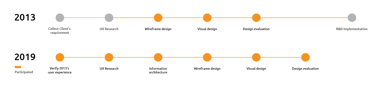
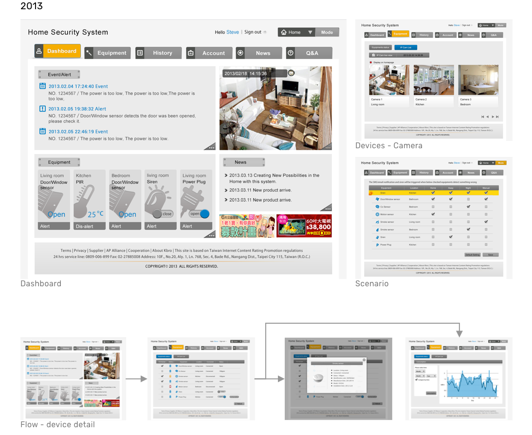
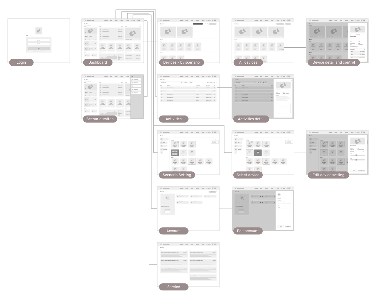
The first smart home system was designed and completed in 2013. It took 6-8 months to finish four portals, including end-user portal, customer service portal, field service portal and administrator portal. 5 years pass, user experience changes and the smart home system evolves. Smart homes are sustainable and provide more functions for users to optimize their life.
To integrate the new user experience and match the trend of the smart home, I individually redesign this smart home project and upgrade the interaction for aligning with new design guideline. I walked through the end to end design process and updated the interaction design. The challenge for me is integrating the new needs of the smart home and continuing the good parts of the previous system for maintaining the user-friendly experience for new and old users.
| Date: | 2019 |
| My Role: | UX Designer, UX Engineer |
| 2019 Member: | Me |
| 2013 Member: | PM: Scott Pan, Peggy Lai, Jin Chen, Eileen Lu RD:Chris Ho, Peng Guan, Jun Yang, Ben Yang, Gang Yang UX/UI Designer:Judith Cheng UX Researcher : Dana Su, Lucia Lin |
To redesign a 2013 system, I criticized the 2013 interface for redesign the system. I reviewed the old wireframe and the UI and discovered several failures from the point of view of current design. It includes:
Part of the issues is from the evolution of design by time. In 2013, Flat design gradually became the trend and the card component that is widely used today hasn’t been introduced yet. I can see a clear generation gap in the 2013 design. Thus, during the redesign process, I also applied these new design elements into the 2019 version.
Another important task is reviewing the old user study insights and journey. Although I didn't participant the research stage in 2013, I closely cooperated with UX research and learned the users' feedback from them. I review the 2013 research reports received from UX research and explore the evolution of user experience and needs of the home security system. During the review, I discover that users still keep many similar patterns for monitoring their house. These needs always exist and will continue for the new system.
However, I abandoned part of the 2013 research insights because they were out-of-date and part of them only applied in Taiwan culture. Also, nowadays, with the development of technology, users use a large number of smart systems and it changes their taste and expectation of digital applications. Thus, to redesign this application, I aim to study modern users' experience and their expectation of a smart home system in order to erase the gap between 2013 and 2019 and synchronize the interface design.

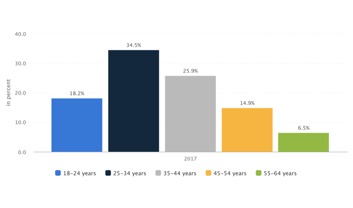
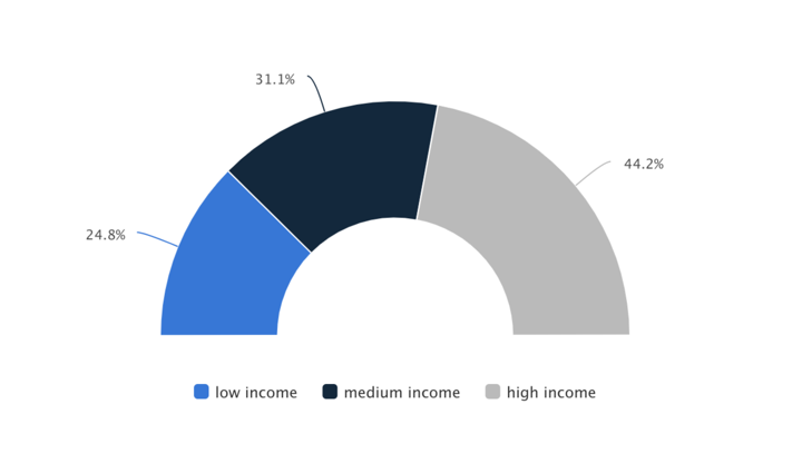
I studied the marketing report published in 2017. I learned that 60% of the smart home system users are the young adult, around 25 to 44 years old. They are in the generation of technology and information explosion, thus, many of them are tech-savvy. They have great knowledge with computer and smartphone and they like to try new application to optimize their daily life. Moreover, 44.2% of smart home users are in the high-income group, which means they have a better quality of life. And, they are more willing to purchase the smart system for securing their home.
Thus, I targeted users in this generation and conducted the interviews with them to learn their current smart home experience and needs, including using security devices, google home, Alexa, Philips bulbs, etc. I particularly focus on:
I got several interesting insights:
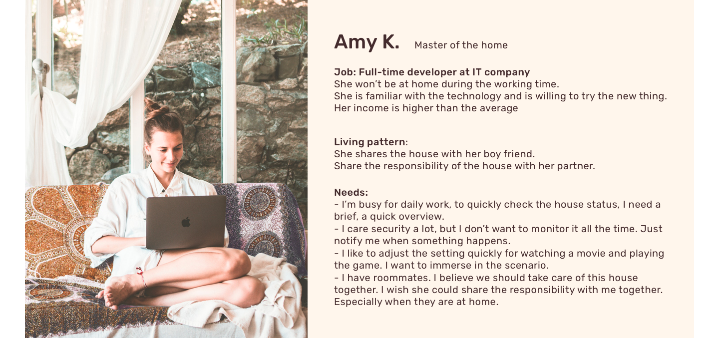
From the interviews, I also outline the profile of the targeted user, the master.
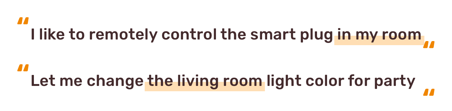
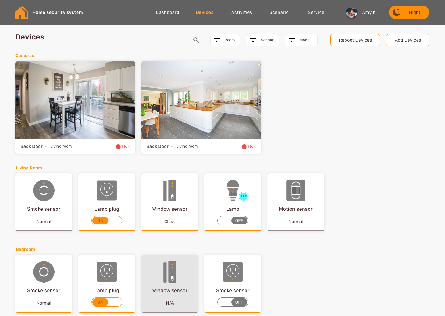
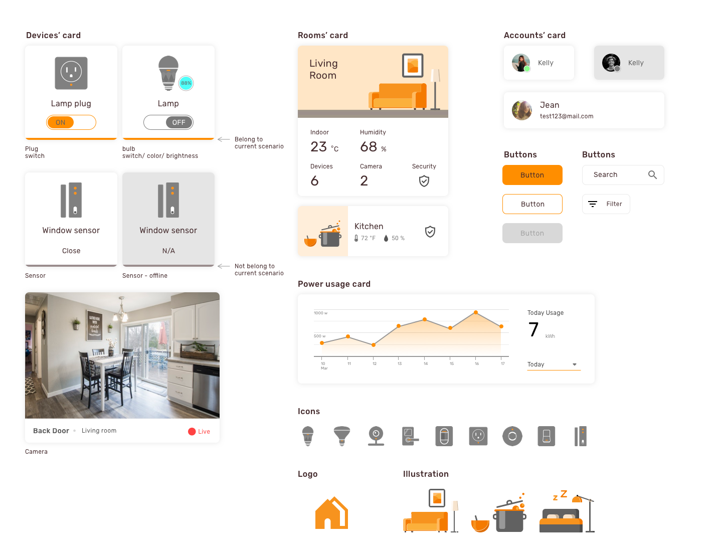
From the users’ interview, I discovered that users tend to bundle their devices with the location when they identify it, especially there are more than two similar devices in their house. Every time they described a device, they all point out a piece of location information for classifying devices. Thus, in order to help users recognize the devices rather than recall it from memory, I categorized the devices information with locations, the room, for users and reduced the effort of targeting the desired one.
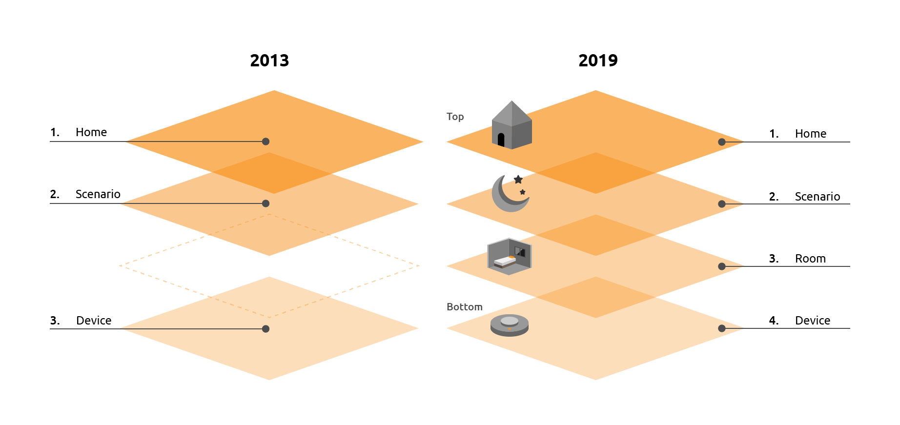
By reviewing the 2013’s design, I discover that the previous design misses the room level information. The old design was a device-oriented design. It popped all devices information for users without classifying them appropriately. Although it provided the room information, users still need to spend their effort to identify the device by reading through detailed information of each device.
To help users make the best sense of their house with data and status update, the new design should organize all devices information and classify them by room for users. Thus, in the 2019 design, I reconstructed the information architecture and design the hierarchy as the above figure.
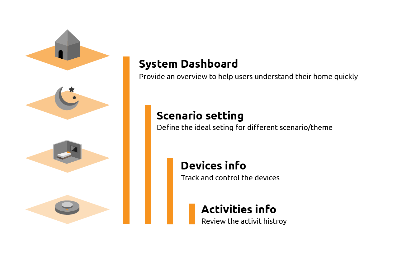
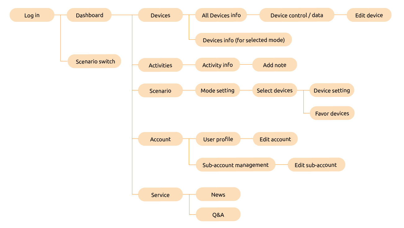
After digesting all insights from UX research and comparative analysis, we started to establish Duudo's structure. We prioritized the functions based on the frequency of use, the importance, and the correlation. We walked through the main functions of this application based on the user journey and came out the below diagram
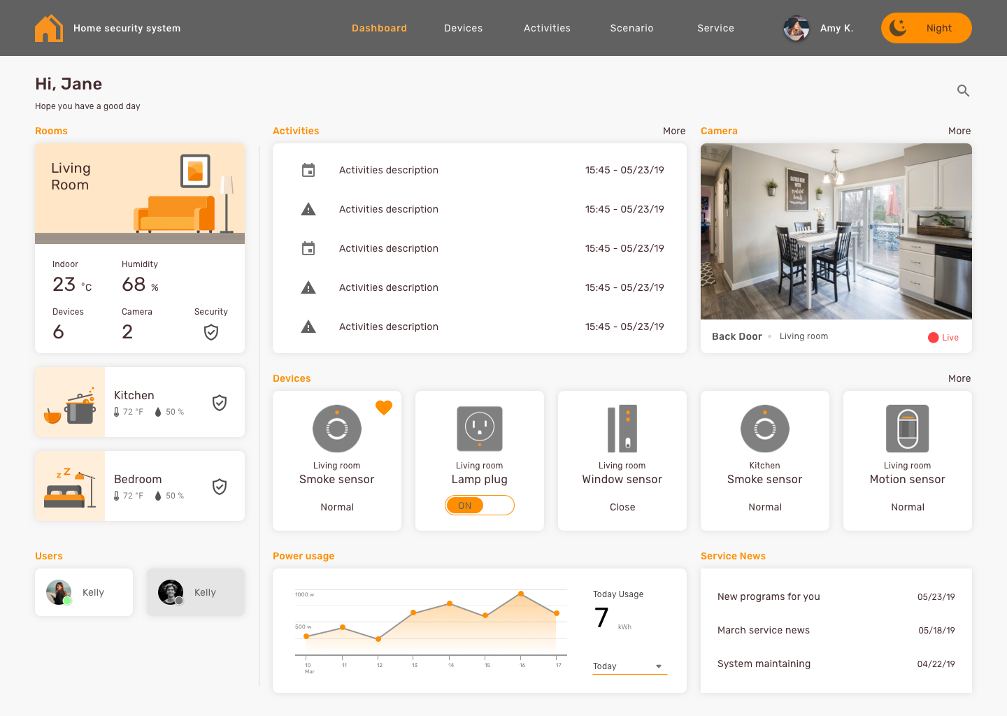
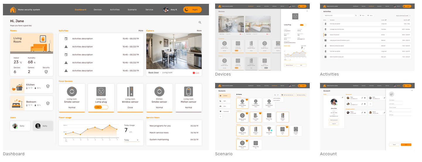
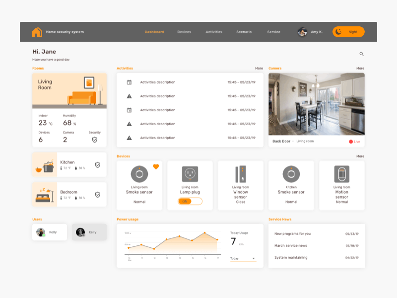
From the research, I learned that users like a quick overview of their home through the smart home system. Thus, the direction of designing smart home dashboard is the analytical dashboard. The analytical dashboard provides users with at-a-glance information used for analysis and decision making, and is less time-sensitive and not focused on immediate action. The primary goal of this dashboard is to help users make the best sense of their house via data and drive decision making.
I used grids to achieve effective alignment and consistency, create a basic structure, a skeleton for the dashboard design.
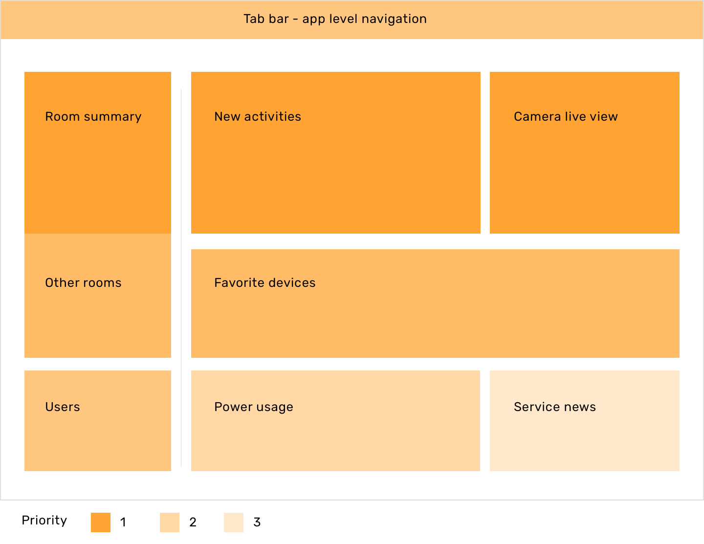
When I was deciding where should the information go, I considered the priority of the information. I followed the information architecture proposed before and prioritized the sections by the information hierarchy and the frequency of use.
The Scenario information covers the whole system, thus, I placed it at the top app bar representing its importance and order.
Under the Scenario umbrella, I still have Room and Devices information. Naturally top left corner of the screen will get more attention so I put the Room level information at the left side. Then, I position the activities notification widgets and devices cards from left to right. Comparing with devices status, activities is the key info that users should pay attention to because it provides the alerts of abnormal situations. At the bottom of the page, I placed the less sensitive and less important information for users, including power usage and service news.
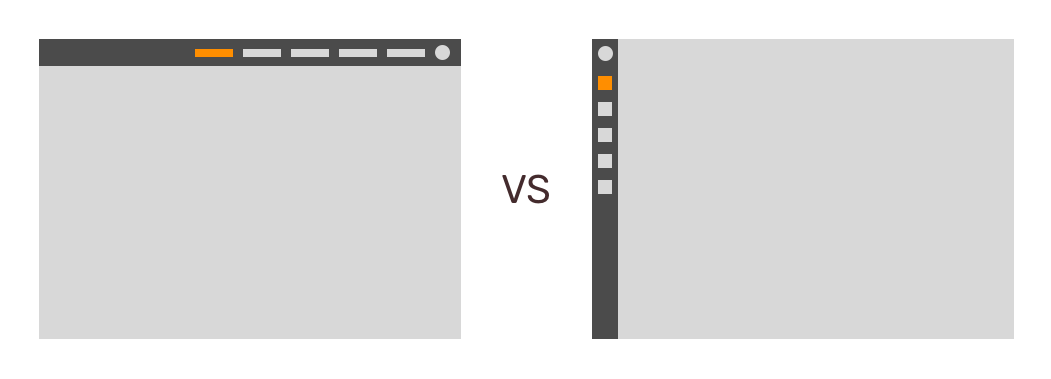
To design the system level navigation, I have considered the side tab bar and the top one. Although many new dashboard designs use the left-side tab bar, I decide to use the top bar because it aligns with the old interface. This design decision can maintain the same experience for old system users and it is understandable for the new users as well.
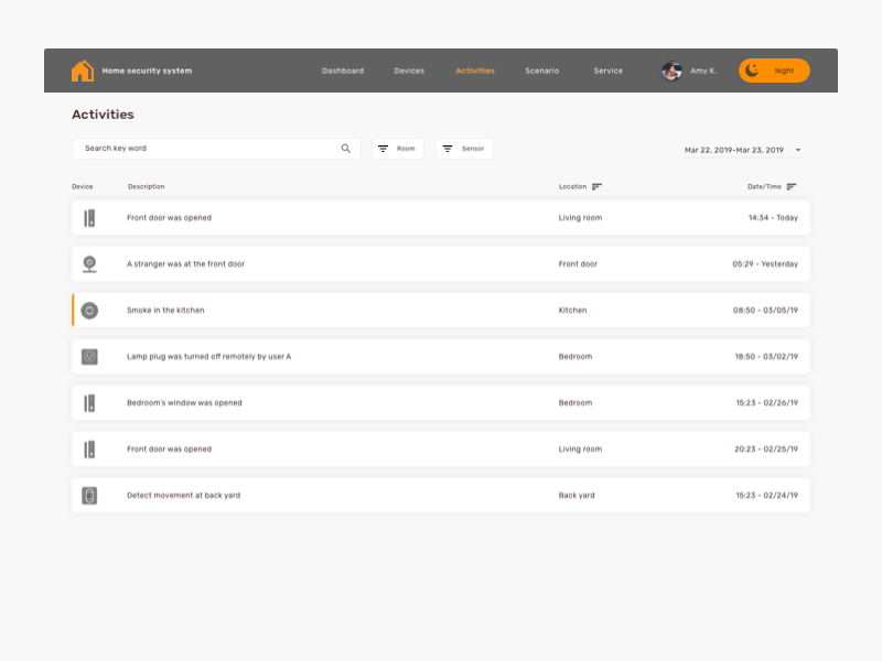
The tab bar contains the major functions provided in the system, including dashboard, devices, activities, scenario, account, and service. Users can easily travel between each page through the tab bar and get further information for each page.
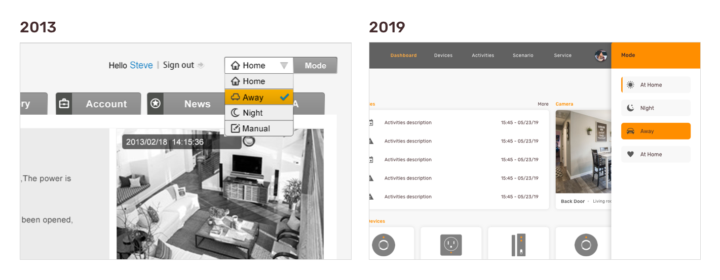
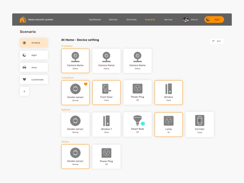
From user study, I learned that users like to quickly adjust their home setting for different purpose and scenario in both 2013 and 2019. It is a constant need for users. Thus, in 2019 version, I transplant one of the great interactions designed in 2013, the scenario switch function on the top bar. In 2013's version, users can quickly switch the scenario mode through a drop-down menu on the top. Once users switch the mode, the entire system will update the setting and match the selected scenario. We got many position feedback for this function from users in 2013. Thus, I transplant it into 2019 version and redesign the drop-down menu for easier control and consistent interaction.
In the new design, the scenario switch function still on the top bar representing the top level of control. Once users change the scenario, the content on the dashboard widgets will be updated immediately and provide the most relevant information for users based on the selected scenario.
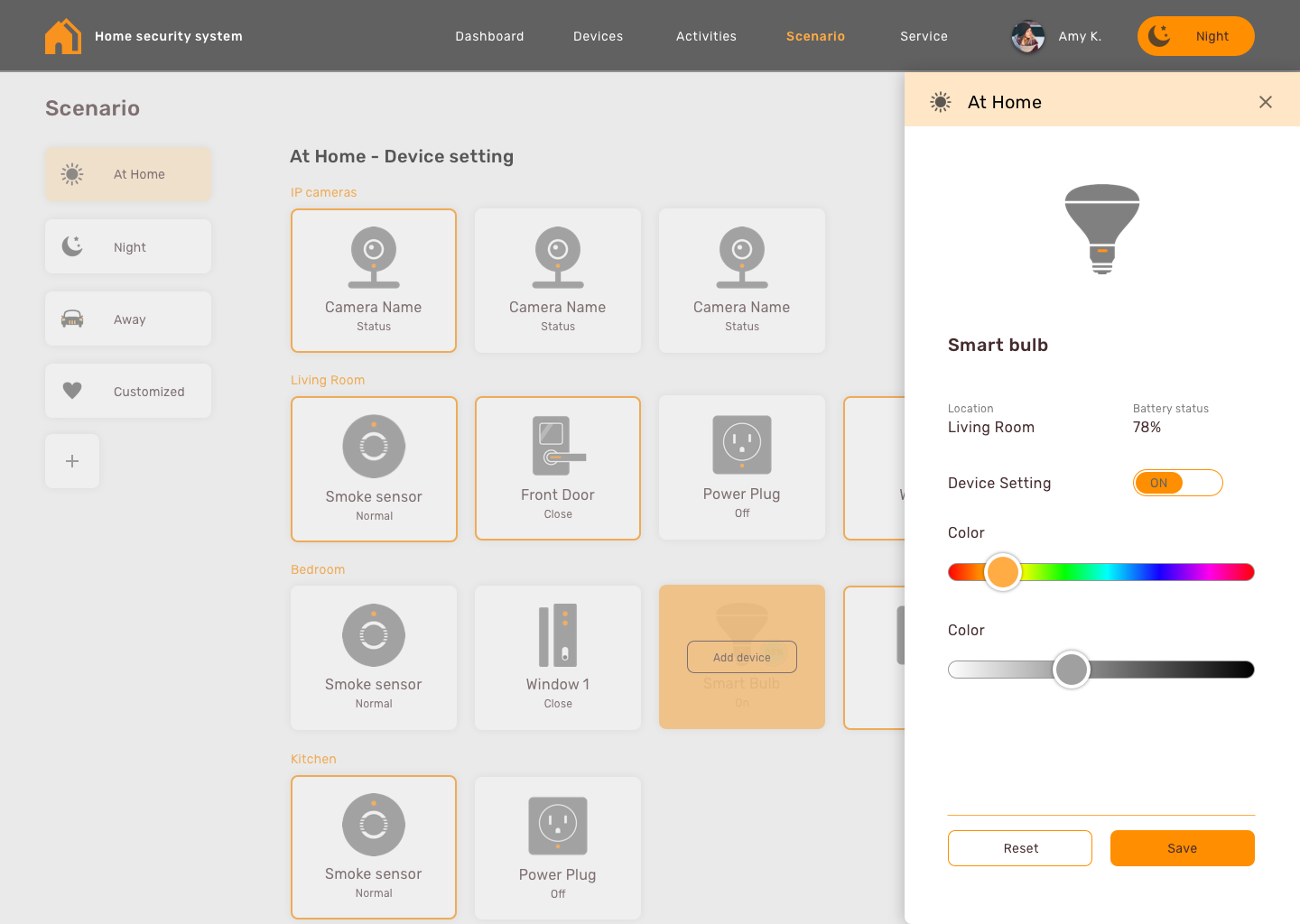
To provide the personalized experience, the smart home system allows users to adjust devices’ setting for different scenario. In scenario page, users can set up the default value of each selected device for different modes and they can change the entire home setting easily by simple click.
Consider the connection between scenario and dashboard’s content, I also design the function that allow users to select favorite devices that they like to check frequently on the dashboard. The favorite devices on the dashboard will be change relatively by the selected scenario.
To streamline the recognition, I classified all devices by its location. Users can easily target the device by the natural way, identifying devices by location.
I separated the camera view from other devices because it provides a different type of information, the video view, that requests larger space on the interface. Consider the space usage and grid system, I put the camera view on the top of the device section and mark each camera with location.
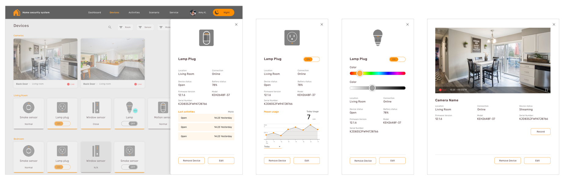
For showing the device level information, I consistently used the right-side panel to show the detailed information of each device and sensors. Once users click the individual device, the right-side panel will fly in and provide further report or control.
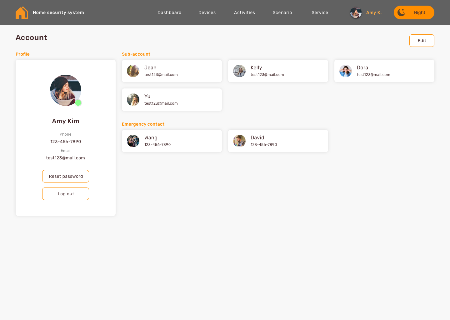
From the research, I learned that the master, the users who own higher control at home, wants their family members or roommates to take care of their house together. The Master like to share the responsibility and wish the system can provide cutting edge connectivity to them. The system can detect whether users are at home and share control with online users. When the master is away, other members can get the master’s back and help to track and adjust the system.
To share the right of control, I design the accounts page helping master to manage the sub-accounts and the contacts. Master can add and edit the sub-accounts and decide who can be the system member.
I believe redesigning the existing system is not reinventing the experience but analyzing the old system and keeping the good experience. Designers should consider both old users’ and the new users’ expectation and then create an optimized design.
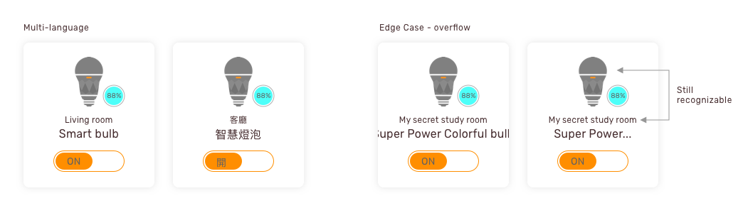
When I designed the 2013 version, I have applied both Chinese and English wording into the interface. When designing a global system, Multi-language version is necessary. For different language, the required space of a word should also be considered and tested. Also, sometimes, designers need to compromise with the languages and edge cases, such as the super long name created by users.