In summer 2018, I interned at Syngenta Digital Innovation lab at Champaign IL, as a UX Designer. I was working on the product design of the Syngenta's website for connecting Digital Innovation Lab to Syngenta itself and the GeoLocation app supporting the UK farmers in managing their spraying work.
In the 12 weeks, I worked with PMs, software engineers, and design mentors to create the seamless and meaningful user interfaces to support Syngenta's business.
Digital lab's website is one of two major projects in my summer internship
| Date: | 2018 |
| My Role: | UX Designer / Front-End developer |
Syngenta itself is a giant organization with conservative thinking and working process for their farming business. As one of the top agricultural companies, Syngenta is slow to learn new techniques of IT development and Design thinking. The mission of our Digital Innovation Lab is to support its mother, Syngenta, to evolve and adopt the User-Center Design approaches. Moreover, we help Syngenta absorbing the Agile/Lean process and transform its mindset. Our goal is to integrate the intelligent technology to farming and support framers to upgrade their work.
However, through the cooperation with other Syngenta departments and the stakeholders, we discovered lots of issues related to :
According to the above issues, our lab faced lots of difficulties to communicate and work with these stakeholders. Thus, the Digital Innovation Lab needs a platform to show our abilities and demonstrate our works to these Syngenta employees, moreover, educate them about the User Center Design approaches.
Considering the accessibility and convenience, we decided to focus on the web platform. And in order to display the needed information, I conducted the whole project and built up the tasks and timeline.
The overall process is:
In order to comprehensively understand what information is needed during the communication with stakeholder, I collected different perspectives. I scheduled interviews with Digital Innovation Lab's lead and Syngenta's stakeholders. The focused questions are :
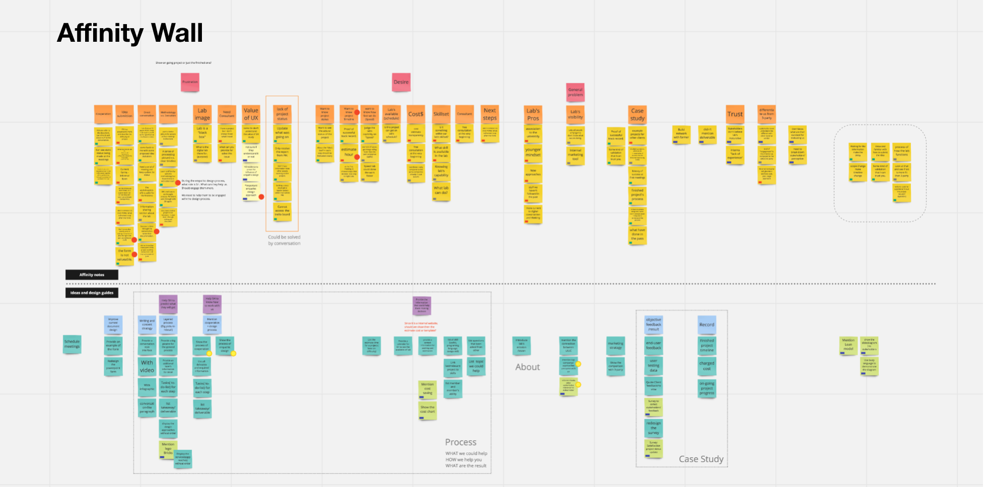
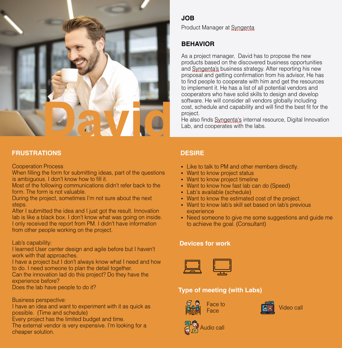
After the interview, I interpreted the feedback from the interviewees and create the persona and the affinity wall. The major discoveries include their desire and their frustration:
The cooperation process is not clear for the SH. During the project, sometimes SH not sure about the next steps. They don't know what happened in the Lab after they submitting their idea. The tasks and timeline are not clear but they always want the project to be finished as soon as possible.
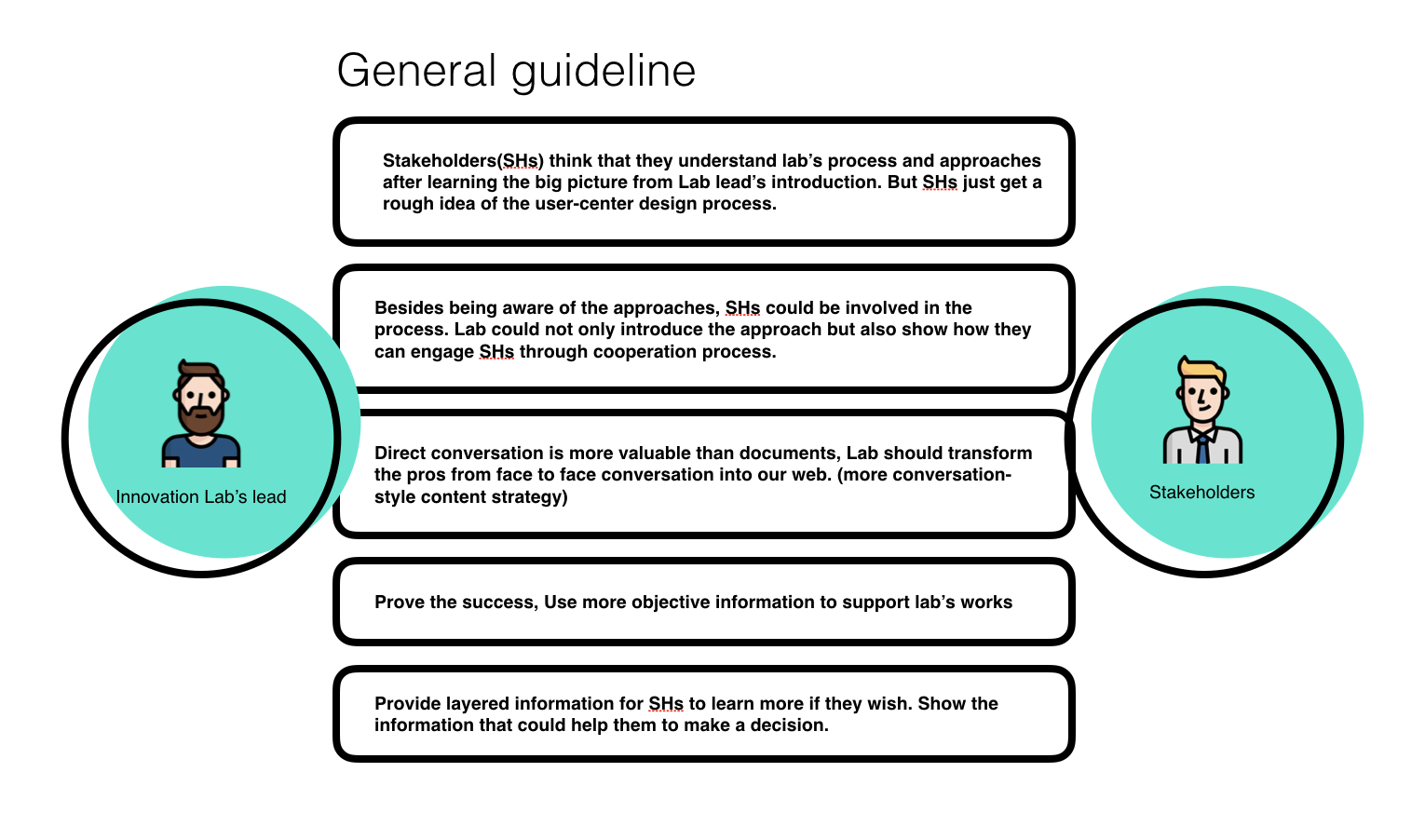
Stakeholders(SHs) think that they understand lab’s process and approaches after learning the big picture from Lab lead’s introduction. But SHs just get a rough idea of the user-center design process.
SH like to shop around the external vendors and DL when they have an idea need to be created. They already imagine the product and wish to find an experienced partner to work for them.
According to the affinity wall and the insight from research, I brainstormed several solutions for the pain points and transformed them to design principles.
At the first stage brainstorming, the brainstormed ideas were rough and high-level solutions. Design detail is lost. Or, the idea was too narrow to solve the wide problem. I classified all solution and summarised the goal that these ideas want to solve and transform it into the design principle for designing the website. Based on the design principle, I came out more feasible and detailed solution, including the way to present the information and the information architecture.
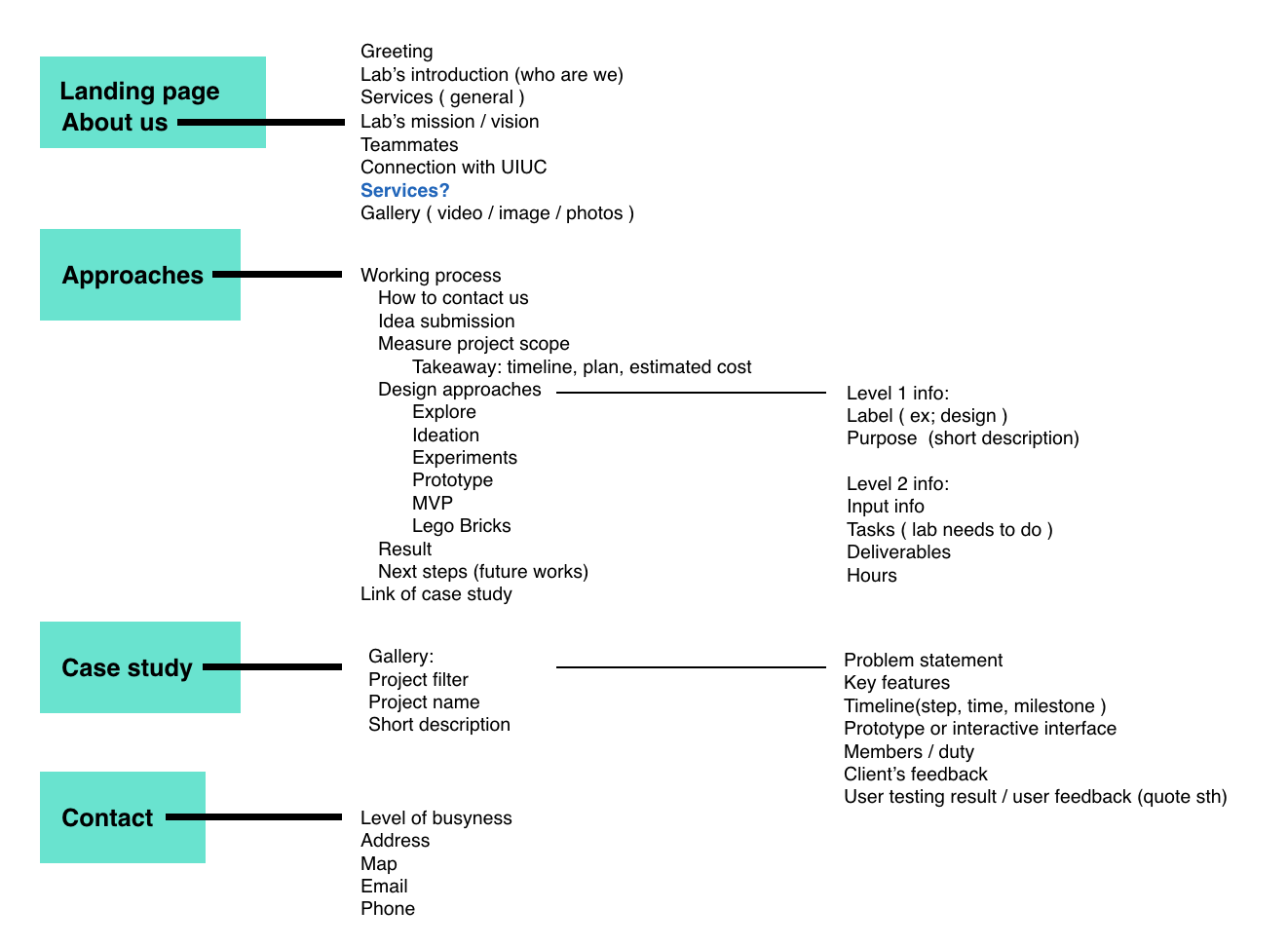
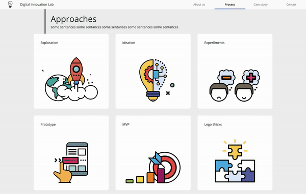
Since there is a mass of information needed to display, I categorized the desired information and split them into five major pages. I created the information tree and showed the hierarchy of content.
Stakeholder(SH) mentioned that DILab is a "black box". The cooperation process is not clear for the SHs
Erase the gap of understanding lad's approach
Demonstrate DILab's skill based on SH's expectation
Stakeholder(SH) mentioned that DILab is a "black box". The cooperation process is not clear for the SHs
According to the research, I discovered that DILab needs to inform SHs the overall cooperation process before starting the collaboration. DILab should not only talk about the applied approaches but also the way to communicate and exchange the information. Thus, the process page is required for explaining the detail and educate SH the UCD methods.
The process page demonstrates the way to connect DILab when SHs have ideas and what material and consideration they should prepare. Then, this page guides SHs to communicate with Lab step by step and provide detailed information for working together.
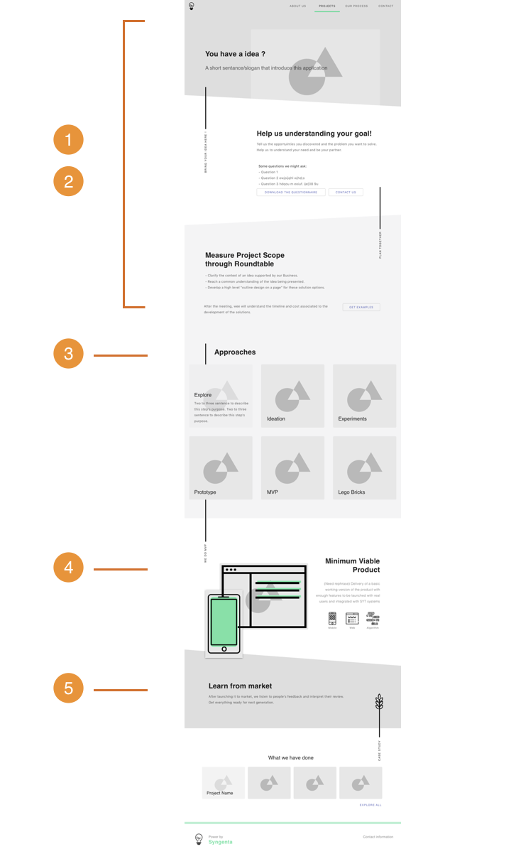
The process page presents the flow in a long page. Thus, how to indicate user to scroll down for further information is important. I designed the trapezoidal background and the animated scroll indicator, the sidebar, to lure users into exploring the hidden information by scrolling down. When users scroll down to certain positions, the end of sections, the sidebar will downward extend and remind users that there is information below.
Erase the gap of understanding lad's approach
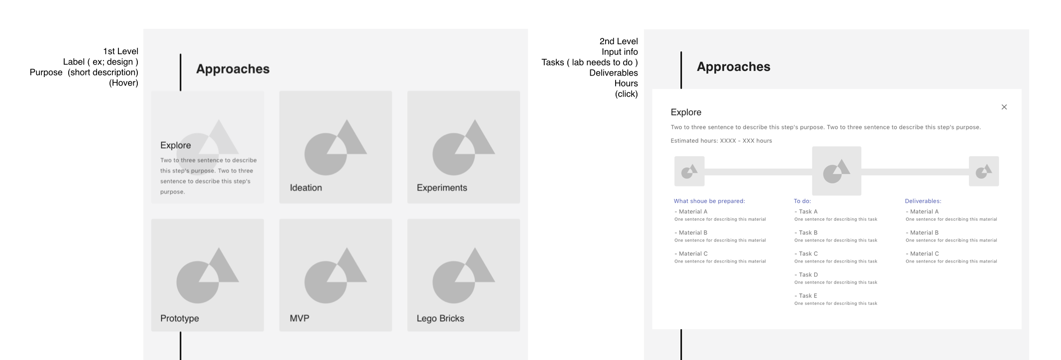
Part of SHs think that they understand and familiar with lab’s process and approaches. Part of them never heard about the applied methodologies. For these two kinds of audience, the website should provide different layers of information for them to explore.
Design element - Interactive cardsFor the experienced users, they can recall their learned knowledge by browsing the first level information, the information showed on cards.
For the users just get a rough idea of the user-center design process or visit the first time, they could learn the detailed information from the second layer. Users can easily select and click a card and the card will be extended for providing second level's content. The second level provides lots of detailed information and educates stakeholders what are the inputs, tasks, and outcomes.
Demonstrate DILab's skill based on SH's expectation
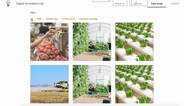
In order to streamline the project/ capability exploration, I design the project filter for the project gallery. The filter could help SH target the interested projects efficiently and reduce the effort of searching for relevant information.
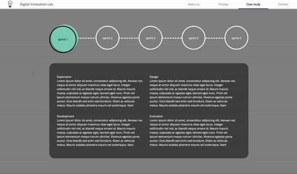
"Time" is one of the important criteria for SHs to evaluate Lab's capability and their cost since "time is the money". A clear timeline from the previous project can help SHs to predict the cost of time and estimate the schedule of their own project. I designed an interactive timeline that shows the finished tasks and the spent time. SHs can investigate each sprint's tasks and get the transparent information. It could help to erase the "black box" image.
For this website, I was in charge of developing work. I use React framework to create the front-end part and use Scss, CSS extension language, to style the web pages.
In order to create a clean code, I followed the react's concept, modeling the components, and classified the folder by shared components, screen, and container. This structure is easy to maintain and be understood by the other developers.
Considering that the administrator who maintains and updates the content is usually a product manager, not a developer or designer. The website should be easy to edit the content without editing the code. Because of the project scope and timeline, our lad didn't build up the back-end system for this website. Thus, from front-end part, I classified all content files ( has javascript object format/ json format) into an isolated folder and help the managers to modify the web within the folder without changing the internal styling and JSX code.